How to Choose a Calm Color Palette for Your Website

Color on a website sets the tone for how a visitor feels when they land on your site, shaping not only their experience but also how they engage with your brand. A clean, calm color palette is perfect for mindful, purpose-driven brands because it creates a space that feels warm & inviting - creating a gentle environment where trust can build, where visitors can settle in and explore what you’re offering without the heavy stimulation that can often come with being online.
When we’re considering the best color combinations for websites with a calm, minimal palette, there’s a few foundational principles to consider. Let’s explore those first, then I’ll share some calming color palette examples, the thought process behind them, and some tips to help you choose the right palette for your brand’s website.
Foundational Principles for Website Color Palettes
1. Keep Your Palette Small & Intentional
Color palettes for websites serve a different purpose than those used in other creative disciplines, such as branding, art, or print. For example, while a brand palette might include a wide range of soft tones or decorative accents, website colors need to be both beautiful and highly functional. They play an important role in ensuring your content is easy to read and accessible to everyone, while also helping users identify links or buttons at a glance. This means a website palette is often more limited and intentional, designed to create clarity and ease, not just visual appeal.
While many website builders give you plenty of freedom to set as many colors as you’d like, I recommend sticking to a core palette of about 3-5 colors: One or two light, one to two accent colors, and one or two dark. This keeps your site feeling cohesive and calming, no matter what platform you use.
Different platforms handle colors in different ways. Builders like Wix, Showit, Webflow, or Wordpress often let you set global colors at varying amounts, but you still need to decide where and how to use them. You do have a lot of freedom, but that freedom means you have to be more intentional to keep things cohesive.
Of the popular builders, Squarespace is unique in that it uses something called ‘color themes.’ This system automatically takes your chosen five base colors and combines them into balanced section styles like Lightest 1 or Dark 1, keeping your backgrounds, text, and buttons clear and consistent across your site. You can still choose custom colors for specific blocks or backgrounds if you want to, but the built-in themes allow your site to feel unified and intentional, without needing to adjust each section manually.
That said, whichever website builder you use, having the option to add many colors doesn’t mean you need to - a smaller palette helps your site stay clear, cohesive, and gentle on the nervous system.
2. How to Apply Your Palette to Your Website
For websites, you’ll notice that there is normally one prominent background color. For soft, minimal palettes, most often that is a light, neutral color - things like whites, beige, light grays, and creams. This type of background gives a spacious, clean, uncluttered feel. However, some minimal palettes will use a darker color as their prominent background which can lend itself to a more sophisticated and modern feel. However, a dark background can be harder on the eyes and therefore not very calming.
Whichever primary background colors you choose, choose 1-2 which will create the main backdrop for your website.
Next, we’ll choose your accent color. This color will be used for things like buttons and calls-to-action, however you can also use your accent color as a background color from time to time to switch things up. For calm, minimal palettes, most often your accent color will be a more muted tone - things like muted greens, blues, and reds. Muted tones provide that sense of softness that we’re looking for with more peaceful aesthetics. However, you can go with deeper tones as well for an accent color like deeper greens, purples, and blues.
Lastly, we have 1-2 darker colors to choose. These will most often become our text colors. So for example if you have a cream colored background, your darker colors will be the text that shows up on that background. For these we can use deep greens, browns, charcoal, or even deep purples and blues.
3. Keep Accessibility in Mind
Accessibility in web design is about creating a good experience for users of all abilities - including those with disabilities. When it comes to color and accessibility, we want to consider color contrast scores that meet the WCAG (Web Content Accessibility Guidelines). For larger fonts, for example things like headings, the recommended contrast score we want to see is something between 3:1 and 4.5:1, depending on the level of standard. 3:1 is the acceptable standard while 4.5:1 is the highest and most rigorous standard. For normal texts like body fonts, the recommended contrast score is 4.5:1 - 7:1 - 4.5 being the acceptable standard and 7:1 the most stringent. There are many places you can check your score online to make sure you fall within the guidelines. Here is one from WebAim, a non-profit providing resources, trainings, and tools for creating accessible web content.
Considering accessibility when it comes to color choices is not only good for those with disabilities, meeting these standards also provides an overall better experience for most users. When text is easier to read, a better experience is generally the result.
3 Calm Website Color Palettes to Inspire
To show how these principles come to life, let’s look at three mock websites I created, each with minimal color schemes that support its unique brand feel.
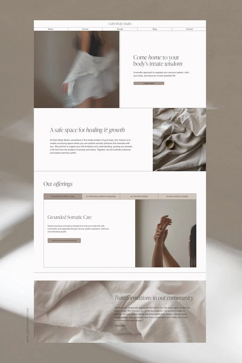
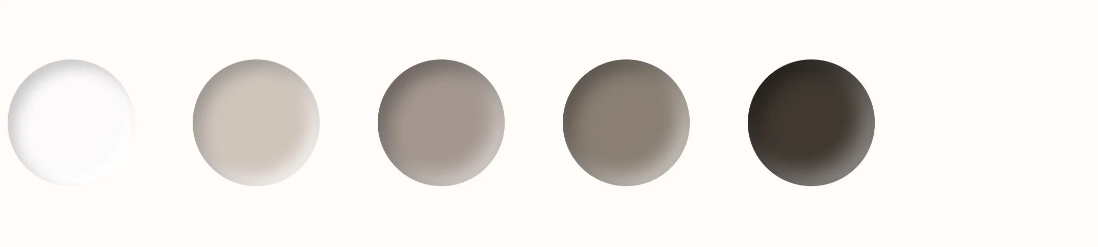
First we have, Calm Body Studio
The Brand:
Calm Body Studio is a somatic practice centered on nervous system regulation and embodied healing. The founder offers one-to-one sessions, small group support, and an online course to help people reconnect with their bodies and discover a steadier sense of calm. The visual direction of the website mirrors this work - soft, supportive, and intentionally unhurried.
The Palette (how it’s used and the mood it creates):
A warm off-white (hex: #FBFAFA) creates a light, breathable foundation throughout the site, allowing both content and imagery to feel spacious. A soft stone neutral (hex: #CFC5BC) is used as a secondary background, helping define sections while maintaining a cohesive, calming flow across the layout. A warm taupe accent (hex: #A4978F) adds subtle depth and warmth, appearing in buttons and small interface details without drawing too much attention. A deeper, smoke-toned neutral (hex: #7F756D) brings contrast for select sections and design elements. And finally, a softened black (hex: #403831) is used for text - dark enough for clarity, yet warmed to avoid the sharpness of pure black, reinforcing the studio’s mindful approach.

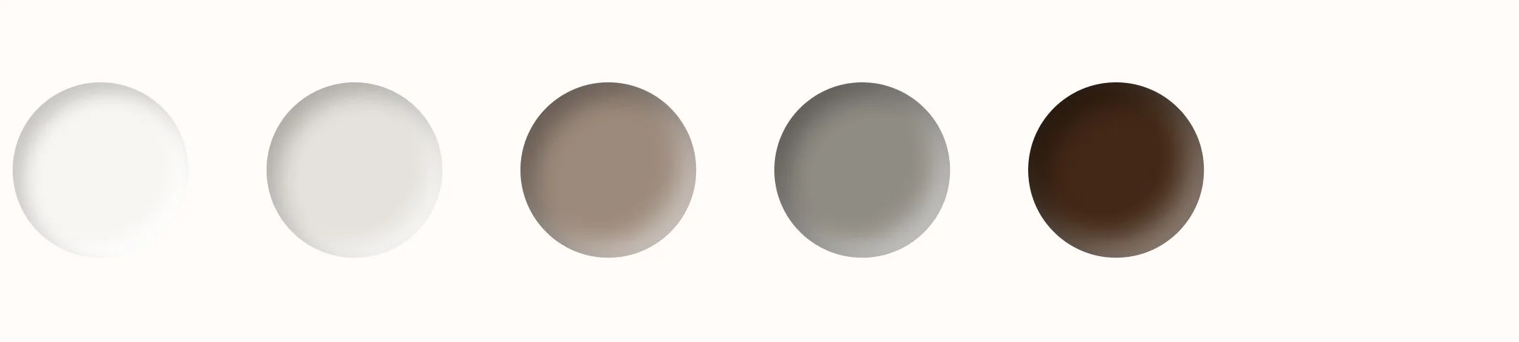
Next we have Studio Kiln
The Brand:
Studio Kiln is a ceramics education space offering both online and in-studio learning. The focus is on thoughtful instruction, material understanding, and steady practice, supporting students as they develop skill, patience, and a deeper relationship with clay. The feeling of the brand is quiet, considered, and rooted in intention.
The Palette (how it’s used and the mood it creates):
A soft off-white (hex: #F8F6F3) is used as the primary background, creating a calm, open foundation that allows the work to breathe. A warm stone tone (hex: #E4E1DB) acts as a secondary background, subtly separating sections while maintaining a cohesive, neutral flow. A clay-inspired taupe (hex: #9C8A7C) is used as an accent throughout the site for buttons and key details with an earthy presence. A muted grey-brown (hex: #8F8C85) introduces depth in feature sections without overpowering the palette. And finally, a deep espresso brown (hex: #422816) is used for text, offering strong contrast while still feeling organic and craft-led.

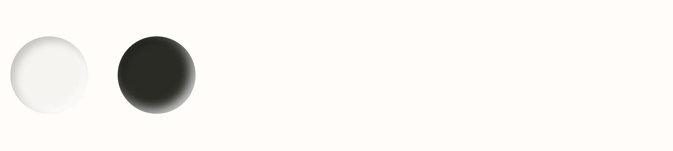
Finally, we have Rise Poetry Collective
The Brand:
Rise Poetry Collective is an online community and boutique shop for poets, writers, and literature lovers. It offers workshops, digital prints, and a small selection of hand-crafted poetry. Its feel is soft, nostalgic, and timeless - like a old book that draws you in, invites you to linger, and leaves you inspired.
The Palette: (how it’s used and the mood it creates):
This palette intentionally uses only two neutrals to show how a simple color scheme can create a distinct and memorable visual identity. A muted white backdrop (hex: #F6F4F1) sets the tone, offering an inviting space that feels open and uncluttered. The deep charcoal (hex: #2A2B25) is used for text, reminiscent of ink on a page. Together, they create a mood that feels soft, open, and inviting - letting each word and image breathe.
These 3 palette ideas show how simplicity and thoughtful color choices can beautifully support a brand’s unique personality - creating a warm, soothing, inviting space that allows your visitors to connect with who you are.
Now let’s explore how you can choose a calm, minimal palette that represents your distinct brand.

How to choose a Calm, Minimalist Palette for Your Brand
1. Reflect on your brand’s personality and values
We’d like your palette to visually express the essence of who you are and what you offer. Let’s look at how our examples do this:
Calm Body Studio uses warm, muted tones, evoking a sense of safety and ease, reflecting its somatic and restful approach.
Studio Kiln relies on understated, natural tones that allow the work itself to take focus. Subtle variations in clay-inspired neutrals mirror the materials at the heart of the practice.
Rise Poetry Collective embraces simplicity with just two muted tones, creating an open, uncluttered space that welcomes readers and reflects the timeless craft of poetry and literature.
By identifying the core feelings and values you want your brand to convey, you can choose colors that naturally support that mood and message.
2. Create a moodboard that represents your brand
Platforms like Unsplash or Pexels make it easy to search for images that capture the feeling or mood of your brand. Start by collecting photos that resonate with your brand’s personality - just be sure to choose images that are free to use or properly licensed. Once you’ve gathered a selection, choose the 9-12 that feel the most aligned and place them into your preferred design tool, such as Canva, Figma, or Milanote.
3. Pull colors from your moodboard to begin building your palette
From those photos, use the eye-dropper tool to pull colors from the photos as a starting point (eye-dropper tools are found in most design tools - alternatively, you can download a chrome extension called Colorzilla which allows you to pull colors from anywhere on the web). Make adjustments to your colors as you see fit, keeping in mind the foundational principles we spoke about earlier - making sure to choose 1-2 light colors, 1-2 accents, and 1-2 dark colors.
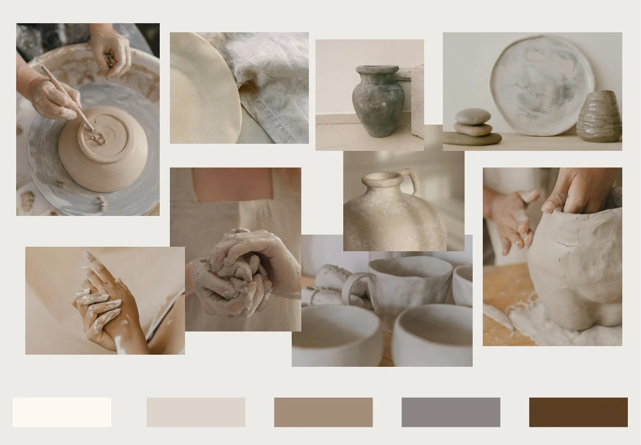
Here’s an example of the Studio Kiln moodboard I created early in the process. It’s not exactly what I ended up with for the final palette, but it helped set the tone and direction.
4. Adjust your colors in your website builder
Next, step into your website builder and start playing with your colors in real time. I find this really helps to finalize the palette by seeing it come to life. Trust your instincts here about what feels right and what best represents your brand.
5. Follow accessibility best practices
Lastly, be sure to check your contrast scores via the accessibility guidelines we discussed previously. You can check them at WebAIM: Contrast Checker or any color contrast checker. Make any final adjustments in this stage.
A soft, minimal palette is more than a collection of beautiful colors -
it’s a quiet way to share the heart of who you are and what you stand for, inviting others to feel that too and connect with you on a deeper level. With thoughtful intention, your palette can help set the tone for meaningful connection and gently draw in the right people.
I hope these insights and color palette ideas will guide you well, and if you’d like support in crafting your brand’s color palette, I’m always just a message away.