Web Design Minimalism: How to Create Clean Websites that Inspire
Minimalism isn’t just a lifestyle, it’s also a design approach. To me, web design minimalism is about reducing clutter and creating an experience that feels light, ease-filled, and enjoyable, while incorporating elements that are both meaningful and beautiful. Together, these choices result in memorable, clean websites that help visitors navigate, connect, and take inspired action when it’s a good fit.
One thing I often notice in discussions on minimalist web design is that it’s equated with stark white backgrounds and pure, black sans-serif text - a look that emphasizes simplicity, but in my opinion, can often lack a sense of approachability or character. While that aesthetic works for some, I prefer minimalism - both in life and online - that embraces simplicity while also embracing warmth, personality, and artistry.
In this article, I’ll cover the core principles of web design minimalism while exploring how to keep your minimalist site feeling warm, inviting, and elevated, with shared examples and tips to help you bring these ideas to life on your own website.
core principles of web design minimalism
Minimalist design isn’t about removing everything; it’s about creating a space that feels calm, clear, and purposeful. Here are the core principles that guide a minimalist website that’s both clean and inviting…
1. Open Space
Also know as ‘whitespace’ in design. Think of this as the breathing room between elements. It doesn’t have to be white - it can be any soft, gentle background - but its purpose is to allow your content to stand out without distraction and make the layout feel uncluttered and intentional. Proper use of whitespace draws attention to what’s important and makes your site feel open and welcoming.
Easeful Navigation:
It’s common for us as site owners to feel like every page must live in the navigation bar. This comes from a natural desire to share everything our site offers and make it easy for visitors to find information. But, when navigation is overloaded, it can instead feel overwhelming, cluttered, or even confusing. A clean, simple navigation bar, with just 5-7 main links and grouping under submenus where needed, helps visitors move through your site with more ease. This approach naturally guides your visitors to the most important content without overwhelming or confusing them. Additionally, I prefer making the navigation bar fixed so that as you scroll down the page, it remains in view - this helps your website guests have access to their next steps without needing to search your site with a lot of effort.
Suggestions:
1. As your designing your layout, remember less is more. Focus on which elements are truly necessary, and give your content room to breathe so the page feels calm and intentional.
2. Most website builders include an option to make your navigation bar “fixed” or “sticky.” In Squarespace, while in edit mode, go to Edit Site Header → Edit Design, then scroll down to toggle on the Fixed Position. As you do this, consider which navigation items are most important for your visitors - focus on 5-7 key pages to keep the bar clean, simple, and easy to use.
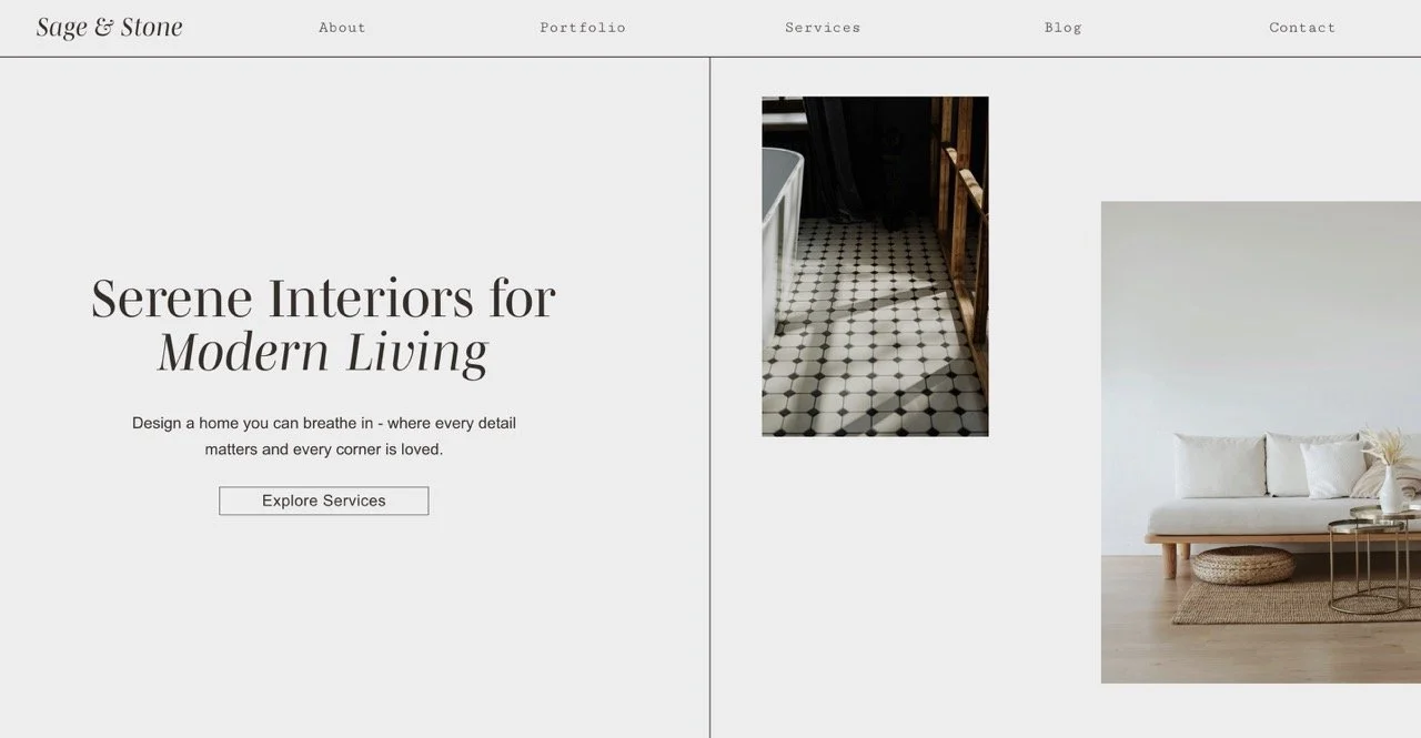
Below, this layout I created shows how generous open space and clear navigation work together, giving the layout room to breathe while guiding visitors with clarity and ease.
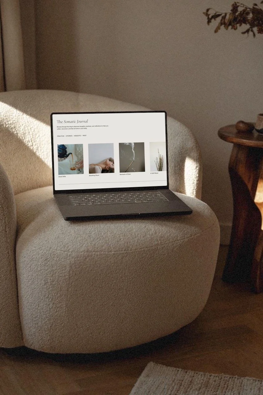
2. Minimal Text
The way text appears on your site makes a big difference in creating a calm, clear experience. It can be tempting to include every detail or explanation in our copy - this again comes from a good place of not wanting our visitors to miss anything important - but too much text can overwhelm visitors and dilute your message. Instead, focus on concise, purposeful copy that guides, informs, or inspires action. Minimal text doesn’t mean cold or empty - it’s about choosing words that matter with intention so that you support the visitor’s experience through thoughtfully guided text.
Suggestion: Assess whether or not you’re attempting to say too much in any given section of your website. Challenge yourself to cut it down to the most essential points, and notice how it changes the clarity and feel of your layout.
3. An Intentionally Small Color Palette
Minimalism thrives on simplicity, and that extends to color. Choose 2-4 complementary colors that align with your brand’s personality. Softer, warmer tones can make your minimalist site feel approachable and inviting, while carefully placed accent colors guide the visitor’s eye to key actions or information. If you want to learn more about how to create a calm color palette for your website, check out a recent blog post I wrote on the topic where I also give examples and suggestions to inspire your own creations.
4. Elevated Typography
In minimalist design, typography is especially important. When you’ve created open space and used text mindfully, the typeface itself becomes a key element of your site’s personality. While minimalist sites often lean on neutral sans-serif fonts that may feel impersonal, a carefully chosen serif display font can feel both refined and distinctive. This approach allows your site to maintain a minimalist aesthetic while still expressing character and warmth. That said, you don’t have to use a serif font - a well-chosen, sans-serif can feel equally elevated and polished, especially when paired with the other tips we’re discussing.
For body fonts, clarity and readability are essential, but display fonts give you the opportunity to convey personality in headings, subheadings, or logos. While there are many free fonts to choose from, choosing a premium, licensed font can give your site a distinctive quality that stands out, while still keeping a minimalist aesthetic intact.
Suggestion:
If you’d like your typography to feel more elevated and memorable, take some time to explore some premium, licensed fonts. A few of my favorite places to browse are Harmonais Visual, Jen Wagner Co., and Creative Market. While there is an added cost for premium fonts, I find it’s often worth it and adds so much character to a minimalist site.
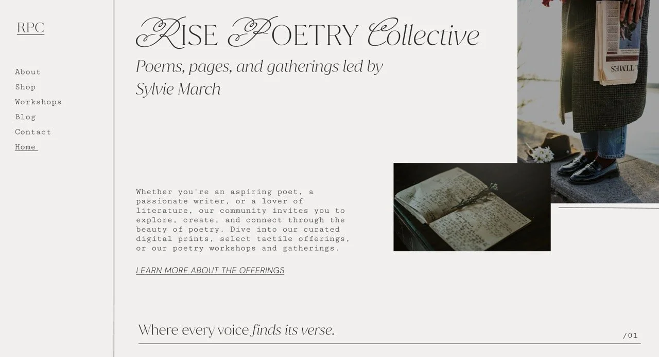
In the example below, the primary typeface ( Juana ) is simple and minimal, yet elevated and adds a sense of originality to the page. The first letter of each word features a decorative touch with an accent font ( Miss Fajardose, a free Google font ), giving the design personality without clutter, while capturing the essence of the brand. For the body text, I used Cutive Mono ( another free Google font ), which provides an appropriate typewriter feel for this poetry collective.
5. Purposeful Elements
Minimalist design is about intentionality, including only what truly matters. Every image, line, button, or graphic is placed with vision and purpose. When you carefully curate the elements on your site, you remove distractions and allow your content and messaging to be fully seen and felt.
Thoughtfully chosen visuals, subtle accents, or a small decorative detail can add personality and warmth without cluttering the layout. The key is balance, where every element has a role in creating a space that feels calm, clear, and inviting.
By intentionally placing elements, you make it easier for visitors to navigate your site, understand your message, and engage with your content, highlighting what’s important and creating a memorable, enjoyable experience for those exploring what you offer.
Suggestion:
Take a moment to look at each part of your site - images, buttons, and graphics - and consider whether they truly support your visitor’s experience. Refining or enhancing these details can make exploring your site feel smoother, more enjoyable, and aesthetically pleasing.
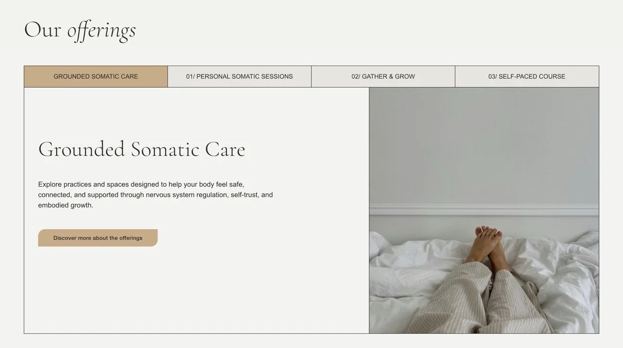
In the example below, I’m using elements that are delightful to look at, yet very minimal and easy to navigate. Again, minimalism in web design doesn’t have to mean boring when we’re able to thoughtfully style the components of our website. ( Note: the element below is a coded component, which allowed me to fine-tune its style while keeping the design clean and minimal. )
When these principles come together - open space, minimal text, a thoughtful color palette, elevated typography, and purposefully chosen elements - you create a minimalist website that feels clean and clear, yet also full of warmth and character.
Minimalism in web design doesn’t have to be stark or impersonal; it’s about designing with intention so your brand and message feels clear, inviting, and meaningful to your visitors - creating a space where they enjoy lingering and where you enjoy creating.
If you’d like help bringing this approach to your own site, I’d be happy to connect. ♡