Website Design for Conscious Businesses: A Values-Led Guide

Designing a website can feel overwhelming - especially as a conscious business owner when you want your digital space to reflect the heart of who you are and what you offer. You want potential clients to feel the value of your work and experience your values in every aspect of your site. And so, you might wonder: How do I translate who I am and what I stand for into colors, layouts, and copy?
This guide will help you align your website with your values, step by step, so you can create a space that feels authentic, welcoming, and resonant with the clients you’re meant to serve.
Why Aligning Your Website With Your Values Matters
1. Invites Connection & Aligned Clients
Our website is a space our audience is invited into - much like a physical space like our home or office. For many of us, we naturally notice how a physical space feels. We can immediately sense if it’s welcoming, organized, and a place we’d like to spend time in. On the other hand, when a space feels cluttered, unorganized, or is lacking a sense of warmth, we may feel less connected and less inclined to linger.
The same is true for online spaces - when a website reflects our values, character, and warmth as a conscious brand, it can be seen and felt right away, evoking feelings of connection, resonance, and curiosity in our right-fit clients. These impressions are shaped by the choices we make in how we present ourselves - through visuals, messaging, and site structure.
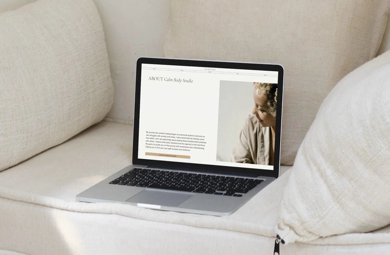
For example, a wellness practitioner emphasizing self-compassion might use soft colors, gentle imagery, spacious layouts, and warm language, attracting clients seeking a patient, nurturing approach.
By contrast, a site aimed at clients wanting quick fixes or high-pressure results might feature bold messaging, busy layouts, and urgent calls to action - creating an energy that doesn’t align with a slower, more reflective approach.
2. Guides Design Decisions
Aligning your website with your values doesn’t just create a welcoming atmosphere - it also brings clarity to your design decisions. When your values guide your choices, decisions about content, imagery, layout, and tone become more intuitive and give you a sense of direction that keeps your site consistent and purposeful. It can make creating feel more easeful and enjoyable when you’re working from a connected place of who you are.
reflect & gather inspiration
Now that we’ve explored why aligning your website with your values matters, I suggest taking some time to reflect and gather inspiration before designing. This foundation will make your design choices more intentional and aligned from the start.
1. Reflect on Your Values
Ask Yourself:
What are my top 3-5 business values? (If you need inspiration, do a quick google search or ask ChatGPT for a list of value words you can choose from)
What do I want people to feel when they land on my site?
What qualities or values are important to come through in my design?
2. Gather Inspiration
Explore sites you admire, especially from conscious brands that resonate with your values.
Save examples that feel aligned and ask yourself: what particularly draws me in? Is it the gentle colors, the font choices, the layout?
Create a Pinterest board (or any visual collection) of your favorites and take note of the specifics that inspire you.
Use these insights as inspiration, without copying, so that your design reflects your values from the very beginning of the process.
If your site is already live:
After completing steps 1 & 2, look at your site with fresh eyes. Imagine yourself as your ideal customer, visiting your website for the first time.
Ask yourself:
What feelings or impressions come up?
Do your pages reflect how you wish your work to be experienced?
Focus on refining one area at a time, to prevent overwhelm.
Once you’ve reflected on your values and gathered inspiration, you’ve built a solid foundation. Now it’s time to translate what you’ve uncovered into the tangible elements of your website - the words, visuals, and structure that shape how people experience your brand.
translating values into design elements
Every choice on your site communicates something, whether intentionally or not. By aligning each element with your values, you create a space that not only looks beautiful but also feels authentic and consistent with who you are.
Here are some core areas to focus on:
1. Messaging
In the current digital landscape, the most common advice we hear is to be loud and even aggressive in our marketing. We’re told to highlight pain points and evoke urgency so people will take action. And while it’s true that acknowledging challenges can help people feel seen and understood, I believe there’s a more mindful, gentle way to connect.
If you’re here, chances are you feel that way too - you likely value content that feels supportive rather than pushy, and your clients probably do too. In a world full of pressure to buy, thoughtful language can feel like a breath of fresh air - often inspiring action more effectively than force ever could.
As you reflect on your messaging, ask yourself:
If I were my ideal client, how would it feel to read my copy?
Are there ways I can add warmth when speaking to challenges, so that it feels more aligned?
Am I using urgent, fear-based language and how might I shift it towards invitation and resonance instead?
Example: instead of “Sign up now before spots run out,” you might say “I’d love to welcome clients who resonate with my approach - here’s how to learn more.”
If you’d like support writing your website content, I created a gentle website content guide for wellness practitioners that you can check out here. It offers structure for your content while doing so in a softer way.
2. Imagery
Imagery plays a huge role in how your website feels. As a conscious brand, you want your photos to reflect the essence of who you are. Spending some time planning ahead can make your imagery more intentional and reflective of your brand.
You’ll likely be working with two main types of images: brand photos (of yourself, your team, your workspace, or your products) and stock imagery to fill in any gaps.
Tips for brand photos:
Create moodboards to capture the feeling you want your photos to convey. You might make one specifically for poses, giving you ideas for hand placement and body angles that can make shots more interesting. Create a second moodboard to capture the tone and setting of the shoot - think about whether it will be indoors or outdoors, the type of location you want, and gather inspiration from others who’ve photographed in similar spaces.
Bring your brand colors into the shoot and think about how lighting will affect them - natural light, darker tones, or lighter tones can create different moods. Consider contrast too: if your website has mostly light elements, incorporating some subtle shadowed or darker-toned images can add depth and visual interest.
Plan non-personal shots you might need: a plant, a coffee cup, a notebook, your workspace, or other small details that reflect your brand personality.
Tips for stock imagery:
Sites like Pexels and Unsplash allow us to curate free stock images. However, a common pitfall is using generic stock photos that can feel cold and impersonal. To avoid this, use descriptive search terms alongside your main keyword while exploring these sites - words like minimal, natural, aesthetic, or editorial can help you find images that feel intentional and aligned with your brand. For example, instead of searching “office desk” try “minimalist workspace” or “warm editorial home office.”
You might also explore paid stock sites to find images that uniquely reflect your brand’s aesthetic.
3. Layout & Spacing
Layout and spacing can make your site feel either cluttered and unorganized or spacious and purposeful, reflecting your brand’s intentional nature. It’s best to avoid clutter or cramming in too much content into any given section, which can overwhelm visitors and dilute your message. Thoughtful placement and open space help your most important messages land while keeping your site approachable and calm.
Tips for an effective layout and spacing:
Prioritize Readability:
Avoid stuffing too much text into a single section. Break content into digestible chunks with headings, lists, or short paragraphs. Assess your current text to find opportunities where you can be more purposeful with your messaging.
Balance Elements:
Arrange images, text, and other content thoughtfully, paying attention to visual flow, alignment, and spacing so each section feels open, clear, and inviting.
Thoughtful layout and spacing ensure your site communicates your values while guiding visitors through a calm, enjoyable experience.
4. Navigation
A clear and intuitive navigation helps visitors move through your site with more ease, making it easier for them to find what they need and get a sense of what it might be like to work with you. For conscious businesses, thoughtful navigation reflects your intentional approach and creates a calm, welcoming experience.
Tips for easeful navigation:
Keep it simple:
Limit the number of menu items to the essentials with no more than 5-7 nav bar items and drop downs where needed. Too many options can overwhelm visitors and make navigating your site feel confusing.
Use clear labels:
Menu item names should clearly describe what the visitor will find on that page. Avoid clever or ambiguous wording that might confuse visitors.
Utilize a ‘fixed’ nav bar:
Your website builder should allow you to configure your navigation bar to ‘fixed’. This means that it will stay in view even as your visitor scrolls. This gives them access to your nav bar no matter where they are on the page. In Squarespace, while in edit mode, go to Edit Site Header → Edit Design, then scroll down to toggle on the Fixed Position.
Place buttons purposefully:
Throughout your sections, add buttons that lead visitors to relevant content or actions aligned with that section, guiding them to learn more or engage where appropriate.
Thoughtful navigation not only guides your visitors but also reinforces the clarity and intentionality of your brand, helping to build trust by providing a clear and easeful experience.
5. Colors & Typography
Our brand colors and the typefaces we choose have such a powerful impact on the overall feeling of our site, expressing our brand’s character & personality, and shaping how visitors connect with us and our work. I wrote a post How to Create a Calm Color Palette for your Website if you’d like more support crafting yours. In another recent entry, How to Craft Clean Websites with Warm Minimalism I touch on places to choose elevated typography, along with other practical suggestions to create a more resonant website for mindful, purpose driven brands.
Taking the time to align your website with your values may feel like a big task at first, but approaching it with intention and thoughtful, step-by-step changes allows you to create a space that truly reflects who you are and the work you care about.
And in that, your digital home becomes a calm, inviting space where the right people can feel the depth of what you offer and become naturally drawn in. ♡